Photography
The backgrounds for these websites are courtesy of these two fantastically talented photographers:
- Sam Egan TRU Marketing & Communications: Main Page
- Alex Binaei Windsor Updates: Projects, About, Blog Pages
Ikea Locations Voronoi Diagram
Today Evan reminded me that Voronoi diagrams are a thing. Now, I’ve looking for an excuse to play around with the OSM for a while, so here we are.
I’ve been looking at things like overlaps of IKEA locations and Costco locations (clearly the two essentials of North American life for me), and I figured it may be fun to start dividing the world into Ikea locations.
This was a quick and quite fun project using Python/Jupyter Notebooks, and I’d like to do more in this direction in the next little bit!
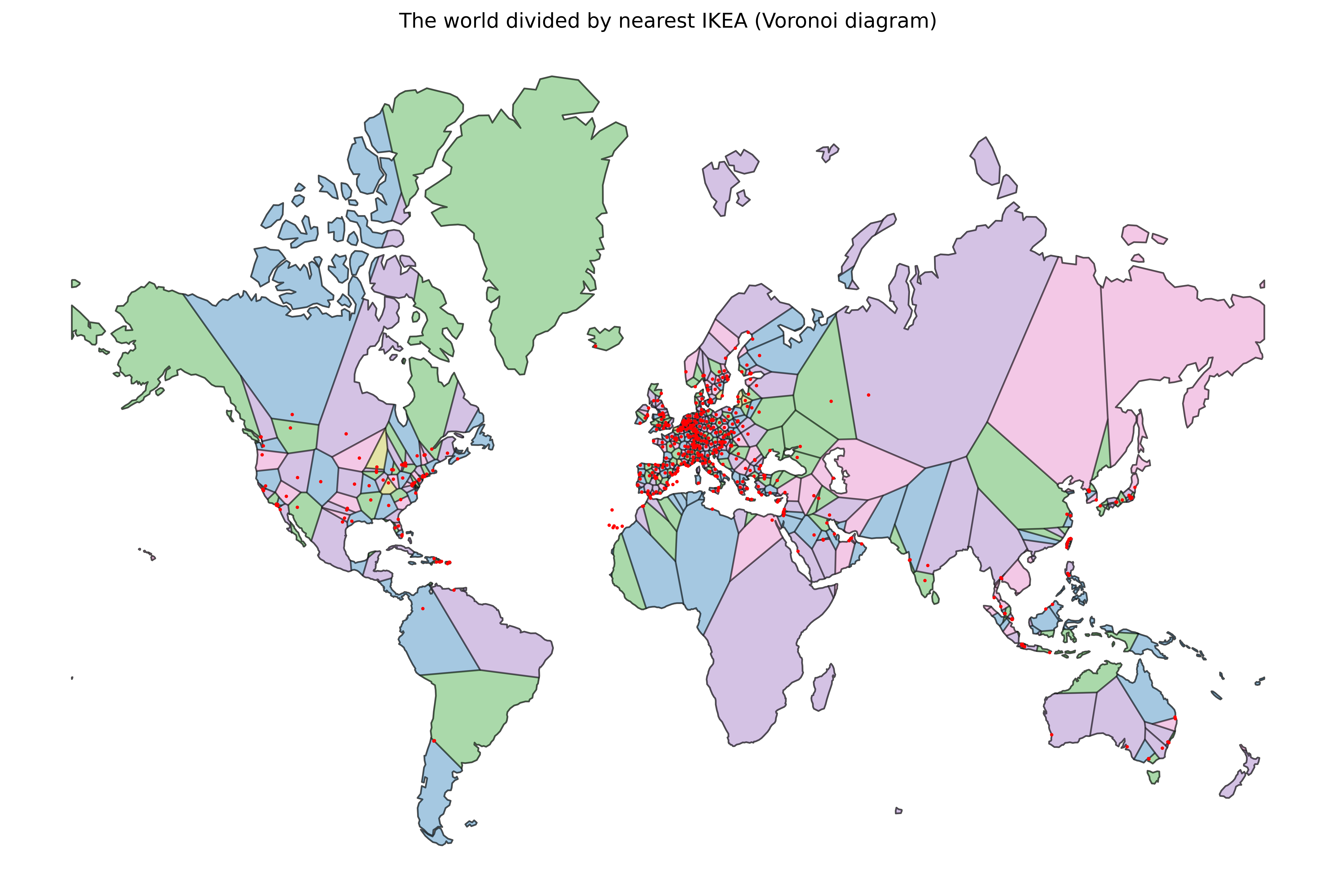
Here is the final map:
I will use the rest of this post to explain how I made it. Full code for this is available as a gist.
A note on dependencies: I originally tried to use geovoronoi for this, but it has not been updated in some time and seems quite challenging to get working with modern versions of geopandas. I switched to shapely for the Voronoi portion which was much nicer to work with.
To get data out of OpenStreetMap I originally used OSMPythonTools with the Overpass API, however I quickly discovered that the query was too large and timed out.
Here is the original code:
from OSMPythonTools.overpass import Overpass, overpassQueryBuilder
overpass = Overpass()

the_world = [-90, -180, 90, 180]
overpass_query = overpassQueryBuilder(
    bbox=the_world,
    elementType=['node', "way", "relation"],
    selector=['"shop"="furniture"', '"brand"="IKEA"'],
    includeCenter=True,
)
overpass_results = overpass.query(overpass_query)
This worked fine when I just queried nodes, but as soon as I expanded this to ways and relations I needed the center point, and that’s when it started timing out.
I switched to overpass turbo (run query from here) with this query and it worked quite well:
[out:json][timeout:60];
(
  node["shop"="furniture"]["brand"="IKEA"];
  way["shop"="furniture"]["brand"="IKEA"];
  relation["shop"="furniture"]["brand"="IKEA"];
);
out center;
Already at this stage it’s quite interesting to see the concentration in certain areas.
I remembered hearing about Ikea locations in South Africa from a friend, and those are missing? It turns out there isn’t really an Ikea in South Africa, but rather something called Home Swede Home which is a third party importer of IKEA products. To whoever came up with that name: I appreciate you!
With the Overpass Turbo results I needed a GeoJSON to be able to import it into geopandas which can be had via Export -> GeoJSON -> Download. I put my copy on the gist.
I guess we can just upload the .geojson file, or we can get it with requests from the gist:
import os
import requests

if not os.path.exists("ikea.geojson"):
    res = requests.get("https://gist.githubusercontent.com/marcolussetti/66bd134ad82c27b0f9da4d9ae55f85fb/raw/9fef8f3f5795ad6401fd07e0ef7dcb2a9fdf3439/ikea.geojson")
    with open("ikea.geojson", "wb") as f:
        f.write(res.content)
GeoPandas reads it pretty easily, but we have to be careful about the coordinate system (epsg). The points are coming from OpenStreetMap which uses the GPS coordinate system (source)) or 4326.
import geopandas as gpd
stores_gdf = gpd.read_file("ikea.geojson")
stores_gdf = stores_gdf.set_crs(epsg=4326, inplace=False)
The tiles we will overlay will be using a Mercator projection (queasy as I feel about this :D) as that is what shapely supports for Voronoi. So we need to convert the points to the target Mercator system, or 3395.
stores_3395 = stores_gdf.to_crs(epsg=3395)
len(stores_3395)
For the tiles I just a common low fidely dataset, Natural Earth Vector’s 1:110m. You can download it from their website or fetch the individual files needed from GitHub, which is what I did. In retrospect, I wonder if I should have gone for at least one of their higher resolution datasets given I ended up wanting to export it quite large to be able to tell at least some of the points (which are so close together!). The main reason I used such a low fidelity dataset is try to emphasize that this is not an overly precise or serious project – we’re just having a bit of fun here.
import geopandas as gpd
import os
import requests
import zipfile

naturalearth_url = "https://github.com/nvkelso/natural-earth-vector/raw/refs/heads/master/110m_cultural/"

base_file = "ne_110m_admin_0_countries"
extensions = [".shp", ".shx", ".dbf"]

for ext in extensions:
    file_name = base_file + ext
    if not os.path.exists(file_name):
        res = requests.get(naturalearth_url + file_name)
        with open(file_name, "wb") as f:
            f.write(res.content)
If all we needed were the tiles, we could do just with the .shp and .shx, but we actually need to filter out Antarctica. Now I don’t yet understand why, but when you render Antarctica with this dataset, it goes all crazy:
That’s hilarious but not entirely useful! So downloading all three files fixes the issue, and they are automatically imported when we read the file with geopandas (see below).
This is where the geopandas part turns out to be useful as we can just “filter out” Antarctica like any normal DataFrame:
world = gpd.read_file("ne_110m_admin_0_countries.shp")
world = world.set_crs(epsg=4326, inplace=False)
world = world[world["NAME"] != "Antarctica"]
area = world.to_crs(epsg=3395)
area['geometry'] = area['geometry'].buffer(0)
area_shp = area.union_all()
I do not know why but this is very amusing to me. Also note here how we have to set the epsg again to get Voronoi eventually working. So the dataset technically is actually also 4326, but again shapely apparently requires Mercator, so here we are.
We now have the points and the area, and they’re both in the Mercator projection. Now it’s a matter of putting it together using Shapely to generate the Voronoi regions (and then plot it).
Before we can generate the regions, we need to convert the points into a format acceptable to Shapely (its own Point class) and filtered out any duplicates. In our set there’s only one duplicate, but still.
from shapely.geometry import Point

stores_3395_arr = np.array(list(set([(p.x, p.y) for p in stores_3395.geometry])))
points = [Point(p) for p in stores_3395_arr]
multipoints = gpd.GeoSeries(points, crs="EPSG:3395").union_all()
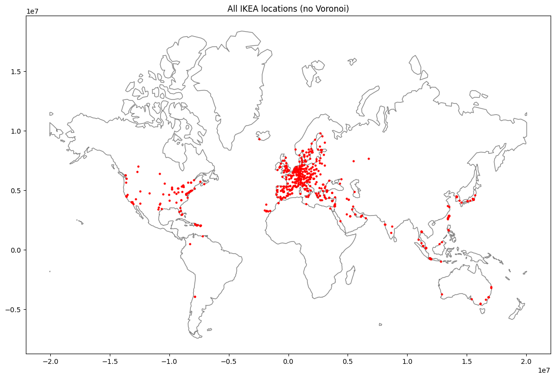
We can actually plot the points (without regions) at this point with a quick GeoPandas Plot:
fig, ax = plt.subplots(figsize=(16, 9), dpi=100)
gpd.GeoSeries(area_shp).plot(ax=ax, facecolor='white', edgecolor='gray')
gpd.GeoSeries(points).plot(ax=ax, color='red', markersize=5)
ax.set_aspect('equal')
plt.title("All IKEA locations (no Voronoi)")
plt.show()
Now to generate the Voronoi regions, all we have to do is call voronoi_polygons, ensure none of the regions escape the boundaries (probably not affecting anything in this iteration, but it took me a while to get here so :D), and turn the regions into a GeoDataFrame we can use to plot things.
from shapely import voronoi_polygons
regions = voronoi_polygons(multipoints, extend_to=area_shp)
regions_clipped = [r.intersection(area_shp) for r in regions.geoms]

gdf_voronoi = gpd.GeoDataFrame(geometry=regions_clipped, crs="EPSG:3395")
len(gdf_voronoi)
Still 574 regions, so we’re good!
Plotting turned out to be both easier and hard than thought I thought. Initial plotting was pretty easy, but colouring the regions was a bit harder.
It’s very interesting to me that so many standard tools for the Python Data Science-y stack work well here because GeoDataFrames are… well DataFrames.
So we can use matplotlib to plot things (I normally love turning to plotnine but good luck doing that for this, I think :D). For the colour, we’re using networkx to look at neighbouring regions and try to mitigate cases with similar colours.
import matplotlib.pyplot as plt
import matplotlib.cm as cm
import matplotlib.colors as colors
import networkx
We can build a network graph with networkx from the voronoi geometry by checking if they touch.
network_graph = networkx.Graph()
for i, polygon_i in enumerate(gdf_voronoi.geometry):
    network_graph.add_node(i)
    for j, polygon_j in enumerate(gdf_voronoi.geometry[i+1::], start=i+1):
            if polygon_i.touches(polygon_j):
                network_graph.add_edge(i, j)
Now we need to turn this into a colormap that can be used in matplotlib. I ended up using tab20 as the base colormap, but you could easily vary this to any colormap you wish.
nx_colormap = networkx.coloring.greedy_color(network_graph, strategy=networkx.coloring.strategy_largest_first)
max_color = max(nx_colormap.values())
colormap = cm.get_cmap("tab20", max_color+1)
gdf_voronoi["color"] = [colors.to_hex(colormap(nx_colormap[i])) for i in range(len(gdf_voronoi))]
With the colormap in hand, the last thing needed is to turn this into a plot. The dpi is pretty arbitrary here, I started with like 120 and then started blowing it up so I could see more details.
I am still not entirely happy with the colours, but for the most part it works. The main case where this fails the multiple regions with the same colour adjacent betweenReykjavik, Iceland and Quebec City, Quebec, Canada.
fig, axes = plt.subplots(figsize=(16, 9), dpi=600)
axes.set_aspect("equal")
axes.axis('off')
gpd.GeoSeries(area_shp).plot(ax=axes, facecolor="none", edgecolor="gray")
gdf_voronoi.plot(ax=axes, alpha=0.4, edgecolor="black", facecolor=gdf_voronoi["color"])
gpd.GeoSeries(points).plot(ax=axes, color="red", markersize=1)
plt.title("The world divided by nearest IKEA (Voronoi diagram)")
plt.show()
Here is the final map (click on it for the full resolution copy):
I was quite surprised with how easy it was to get Voronoi diagrams once the data was in there. The code to generate the regions was just 3 lines, I’m very impressed with the strength of the libraries in this ecosystem.
The map was interesting, but it is too large a scale to encompass in a single PNG. I think an interactive map would have been way better. I think I may try and do this again in some format with Folium for that, at least for my own exploration.
In terms of the data, I was quite surprised with how many IKEAs there were in the Canary Island. Despite my relative proximity to it (I was born in Italy), I didn’t realize there were over two million people living there, but even with that in mind, that’s quite the density (especially compared to Canada!).
European density was a challenge, and this would require a separate, more focused diagram to show this.
As Evan was involved, we figured it would only be natural to get a match one of Aritzia locations. The changes needed were quite minimal: new overpass turbo query, and a different boundary box so that only Canada and the United States are included.
Here is the overpass query:
[out:json][timeout:60];
(
  node["shop"="clothes"]["name"~"Aritzia", i];
  way["shop"="clothes"]["name"~"Aritzia", i];
  relation["shop"="clothes"]["name"~"Aritzia", i];
);
out center;
The other change is the filtering. You could choose to filter by world["CONTINENT"] == "North America" or by the individual countries:
world = gpd.read_file("ne_110m_admin_0_countries.shp")
world = world.set_crs(epsg=4326, inplace=False)
world = world[world["NAME"].isin(["Canada", "United States of America"])]
So here is the result (click to make full size):
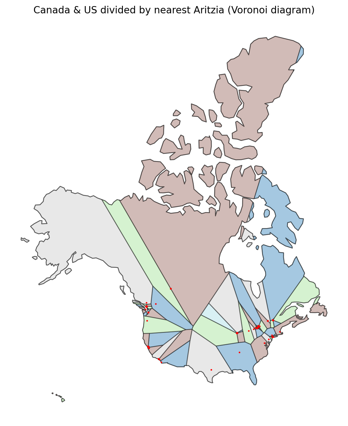
Fun fact: there are two Aritzia in Edmonton, 10 in the Metro Vancouver area, and 19 in the Greater Toronto Area. This produces some pretty bizarre splits.
Credits